Sunday, October 9, 2011

"Troop 142"


Today I look at Mike Dawson's "Troop 142"

Comics, for the most part, are a fairly escapist medium. We buy them to see caped gods fly about and right injustices. We buy them to see these heroes tackle problems that are so larger than life, you sometimes can't help but feel rather disconnected from the whole affair.

But then you find comics and graphic novels that don't paint a fantasy world of impossibility. Stories that hold a mirror up to the reader, and instead of giving them an outlet of escape, asks them to look within at our own humanity and weakness. Mike Dawson's "Troop 142" is one such comic.

"Troop 142" follows one week in the lives of a Boy Scout Troop at the Pinewood Forest Summer Camp. We get to take part in the whole camp experience; The canvas tents, swimming in a cold lake, merit badge classes, and god awful scent of the outhouses. But don't be fooled into thinking that this comic is simply a camping brochure, sharing the wonders of the great outdoors. Because Dawson's real focus in this adventure, is the boys and Scoutmasters of the Troop.

Dawson captures all the awkwardness and frustration of youth in his characters. Any man young or old will most likely remember the lashing out at authority figures, the many rites of passage, the pranks and jokes at other's expense, and the locker room language. Not only with the excellent dialogue and situations he places them in, but their awkward proportions and postures clearly express that time of adolescent change.

This is probably the most difficult review I've had to write to date, largely because I myself was a Boy Scout. Someone who wasn't a part of that organization might read this book and be able to see it as just another story, just another "coming of age" comic. But myself, I read "Troop 142", and I see myself on every page.  Because of that, it's hard for me to treat this like any other comic. I could FEEL all the frustration and awkwardness at the changes going on in myself and those around me while reading this book. But "Troop 142" also brought back the fond feelings of bonding and brotherhood that I found in my own Troop.   

Dawson brings up a number of issues concerning Scouting that are quite prevalent in the world today; Allowing gays into the organization, and the importance of religion in the very foundation of Scouting are two of the big ones. Dawson does an excellent job of bringing these topics to the reader, but allowing them to form their own opinions on the matter. These are also things that only the adults and Scoutmasters talk about, effectively showing that these are clearly not the issues for Scouts busy with exploring their own youth.

The art in "Troop 142" is one of those excellent instances where the visual representation matches the story being told perfectly. I've already mentioned the excellent way that Dawson has portrayed the adolescent awkwardness of the young Scouts. Dawson's inks have a way of moving between the smooth, rather out of place bodies of the Scouts, to the gritty yet harmonious environment of the forest around them. This, along with the excellent use of lights and darks around the campfire really sells the summer camp setting.

Overall, Mike Dawson's "Troop 142" is an absolute must have on your shelf full of comic books. While it certainly has the ability to make us relive some our more unwanted memories of youth, it also fills us with a warm nostalgia over the friendships we had back then. And whether you were a Boy Scout (or still are, as many say) or not, "Troop 142" will still make you have a good ponder about morality, religion, cleanliness, and all the other points of the Scout Law. "Be prepared" is the Scout Motto. So be prepared to enjoy "Troop 142".

"Troop 142" can be read at http://troop142.mikedawsoncomics.com/index.html/ .  More of Mike Dawson's work can be found at http://www.mikedawsoncomics.com/ , as well as contact info.

Wednesday, October 5, 2011

The following review is NSFW, as is the comic being reviewed. If you are squeamish about gratuitous gay sex in humorous situations, this book is not for you. 


Today I take a look at Rick Worley's comic, "A Waste of Time".

This review is a first for this site on a number of levels. This is the first Mature comic I've ever reviewed. It's also the first independent comic I've reviewed thus far. Finally, it's the first of many books I picked up at the 2011 APE con in San Francisco.

Rick Worley's "A Waste of Time" is a charmingly candid collection of autobiographical tales, told by Worley's artistic representation of himself- A cute anthropomorphic rabbit. Indeed, looking at the cover art, one might see this plush looking rabbit and think you've perhaps picked up some strange incarnation of Hello Kitty... That is until you notice the tied up "twink" wearing bunny ears that also graces the cover of this collection.
This comic takes a look at many facets of gay culture that no one really likes to address in this politically correct world of ours. There's a rather wonderful quote from the foreword by EvilJeff of Comic Book Queers; " There's so much PC bullshit going on in the gay community that we tend to avoid portraying gays as meth addicts, self-loathing alcoholics, masochists and porn junkies. Rick Worley has geniusly realized he can show gays at their worst if they look like cute bunnies, robots and teddy bears. I, for one, feel he's one of the few faggots out there telling the truth. He doesn't hold back."

Some might say this comic is all shock value, and there's enough of this subject manner on HBO for George Carlin to come back from the grave and give us 7 more stand-up specials. But, with both Carlin and Worley, what makes them funny AND applicable is that all of their observations and musings come from real life. The further you get into "A Waste of Time", the more you realize just how much of it is deeply autobiographical for Worley, and that you yourself find you have more than a little in common with this rabbit.

Art snobs might initially see the anthropomorphic caricatures of Worley and his friends as amateurish, and look no further. But the truth is, these characters are drawn with smooth, confident inks, by a man who knows very clearly the expressions and motivations he wants his characters to display. And his art certainly changes styles when you see the many pinups of the boys he's drawn. Gone are the cartoonish proportions, but added is a fantastic use of hatching ink work that really shows the dedication of the artist to his model. He does a fantastic rendition of  Michelangelo's "Victory" with all the care and detail of a Dore' drawing.

I always have to tip my hat to comic book artists who can tell a story completely visually. Now certainly, there's plenty of dialogue in "A Waste of Time", but there is also a section called "Marching to The City", which is a stunning visual journey through the roller coaster ride of a relationship, and all the ups and downs that go with it. If NOTHING else in this book appeals to you, you should still buy it to see cute robots go about their daily lives, and what happens when love, lust, and loss is introduced into that equation.

Ultimately, "A Waste of Time" is just the opposite. Worley has given us a refreshing dose of reality that I believe people will relate to, whether they're gay, straight, or in between. I for one am very much looking forward to more volumes of this work, and hope to see Rick Worley pimping more books at APE Con next year.

You can read "A Waste of Time" online, as well as contact Rick Worley at "http://www.rickworley.com/"

Sunday, August 21, 2011

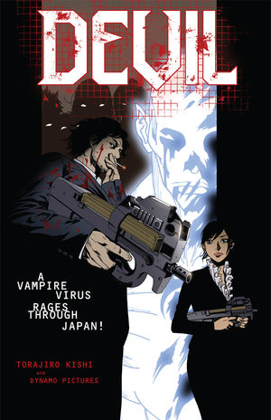
"Devil"


Today I take a look at "Devil" by Torajiro Kishi, and Dynamo Pictures.

A few months ago, when Border's Books started going out of business, myself and countless other comic book nerds flocked to the emptying store to take advantage of the liquidation prices. Most of the popular titles got snatched up pretty quick, leaving many books that I'd never heard of. In the instance of "Devil", a random pick turned out to be a pretty decent purchase.

"Devil" is somewhat a rarity in several respects. It was written AND illustrated by Torajiro Kishi, giving the art and story a powerful unity that can be rather hit or miss with collaboration comics. Also, while the art style would probably be labeled as "manga", the book itself was designed and published under American comic sizes and standards. This makes the book far easier to read for manga fans who might not have caught on to the right to left reading format yet.

The story takes place in Japan, in a future not far off, where a new virus has started turning people into superhuman bloodsuckers known as "Devils". Now, before you write this off as another stupid vampire comic, you should know that "Devil" provides a rather fresh take on the vampire phenomenon. For one, these Devils don't sparkle. Big plus there.

Through following the lives of Detectives Takimoto and Migiwa of the Devil Investigation Section of the Tokyo Police Force, we begin to realize that the Devils are an accident of over ambitious science, and humanity is mostly helpless to offer aid to the victims off this virus. This tale also brings up a fascinating point about human existence; We humans have no predators. We've essentially removed ourselves from the circle of life, and instead of our lives focusing on "How do we survive?", we're only concerned with, "How should we spend our lives?". Knowing that, what would occur if a new predator was introduced into the equation? The underlying fear in "Devils", is that in such a scenario, the human race would eventually be wiped out.

This comic is definitely not for kids. It's a good ol' Japanese spatter fest, complete with blood explosions and rather nightmarish imagery. The art style is a pleasantly detailed mixture of manga-eqsue characters and more Western style inking and coloring. I was particularly impressed with the detail shown to all the various weapons and machinery involved in the comic, as well as the original design of the "Devils". Instead of sparkly humans with pointy teeth, you get glowing skeletal figures, seemingly having their flesh burned off by their own internal energy.

Overall, the premise of this story is fascinating enough that I would like to read more. Sadly, I don't feel quite enough was revealed in the 4 issues available at the moment. It's a great teaser, but I'd be truly disappointed if Kishi and Dark Horse Books don't have plans for continuing this series. It was a great read to get on sale, but given its lack of continuation at this time, I'd check it out at the library.

TL;DR - INTERESTING STORY IDEA, BUT NEEDS MORE ISSUES BEFORE CONCLUDING.


Friday, August 5, 2011

New Job

So, I just found out today that I got offered a position as a Game Tester for Namco Bandai. This means there will probably be less time for me to read comics, and even less to write these reviews. BUT I'M STILL GOING TO WRITE EM ANYWAY. They just won't be quite as regular.

Tuesday, August 2, 2011

"Star Wars:The Old Republic- Blood of the Empire"

Today I read “Star Wars: The Old Republic- Blood of the Empire”, written by Alexander Freed, with pencils by Dave Ross.
Now, I have to start by saying, I love Star Wars. It’s probably been my favorite mega-franchise of all time. Ever since I was a kid, I devoured the movies, the novels, the video games, and more recently; the comic books. That being said, I’ll be the first to admit that when it comes to Star Wars’ various offshoot mediums, they’re usually pretty hit or miss. For good or ill, “Blood of the Empire” is neither.
The “Old Republic” comics are tied in with Bioware/Lucasarts upcoming video game of the same name. To give you a bit of timeline, the events of this comic take place 3,600 years before the Battle of Yavin. I know very little about this particular era of Star Wars history, but Borders was going out of sale, and this book ended up costing around $3 after all the discounts, so I figured I’d take a chance.
“Blood of the Empire” seems to follow the recent trend in the Star Wars universe of focusing on the Sith- The intergalactic bad guys. For those not familiar with the Sith, imagine the kids at Hot Topic, add a hell of a lot of tribal tattoos, red lightsabers, and they’re perpetually angry. Such is the general background of the main character in this issue, Teneb Kel, a Sith apprentice who is essentially turned into the errand boy for the Sith Council. His job is to find and kill a Sith traitor who is planning on helping the good guys blow up the Sith home world.
The plot in this particular issue is about as steady as the Millenium Falcon’s hyperdrive; it’ll eventually get you where you need to go, but it’s gonna sputter a bit before it finally kicks in. Now, some of these plot hiccups serve to give the reader a better idea of Sith history and culture, which is great. But there’s also some crazy hallucinations that could possible stumble a reader not as familiar with “Fear and Loathing in Las Vegas” type visions. That being said, there’s some cool mysteries that get mentioned in this issue that I definitely want to see played out in future volumes. Freed has given us a nice look at this particular era of Star Wars history, now he just needs to explain why it’s important.
Star Wars has had a long history of producing excellent art, though that’s not always been the case when it came to their comics. “Blood of the Empire”, however, rises above some of the less dynamic art styles used in previous Star Wars comic titles. The pencils by Dave Ross give the characters a very visible level of emotion, and add enough flash and bang to make the fight scenes seem as if you were watching them on the big screen. That being said, the inks by Mark McKenna, while excellently crisp and perfectly placed, seemed to lack the heavy, solid black shadows that I think would fit with the overall shadowy nature of the Sith.
 Where this issue really shines, though, is in the colors, and the cover illustration. Micheal Atiyeh brings the page, and the whole feel of Star Wars, to life with his excellent choices in both color and light. His use of metallic reflections and glow effects really deliver the patented Star Wars look. Finally, the cover illustrations by Benjamin Carre’ were what drew me to this title in particular. The painterly look of his work looked as if it was taken out of some un-announced film that George Lucas had been hiding for years. The lighting, the dynamic action, the composition; all of it screams, “BUY ME!”
I will honestly be curious to see just how the “Old Republic” comics proceed over time. I think there’s some great potential here to tell an exciting new chapter of Star Wars history. Or it could end up being a failed attempt at synched merchandising for the upcoming game. But this issue, “Blood of the Empire” , while not being a comic masterpiece, delivers on a variety of levels, and leaves me wanting to read more. Time will tell where this Padawan ends up.
TL;DR: AWESOME COVER, SMALL STORY HICCUPS, SHINY THINGS. BORROW IT FROM A FRIEND OR LIBRARY.

"The Unwritten"

               Today I took a look at “The Unwritten-Tommy Taylor and the Bogus Identity” by Mike Carey and Peter Gross.
               To begin, I should tell you about my friend. We’ll call him The Doctor. Doc is pretty much my go to guy whenever I’m clueless as to which comics I should start reading (which is surprisingly often). So when Doc says, “Man, you’ve gotta check out Unwritten. It’s like an English major’s wet dream,” I take the hint.
               “The Unwritten” is an excellent example of the emerging genre of literary/fantasy based comics that have been creeping in more and more in the once super hero exclusive comic book shelves. It’s refreshing to see a tale set in the “real” world, while still implementing magical elements of the fantasy genre, without seeming tacky or out of place.
               So, let’s imagine Harry Potter (this will be easier for some of you than others), except let’s say that JK Rowling had a kid that she actually named Harry Potter, and drug this child to all over the world building a fan cult around little Harry, with a good percentage of the world thinking he is actually a boy wizard who came to save us all from He Who Has No Nose. That is essentially what you get in “The Unwritten”, except instead of some wholesome Boy Scout, you get Tommy Taylor; an alcohol swigging convention personality, trying to desperately break free from the image of his literary counterpart. He also has some really garish bowling shirts. Then again, if everyone thought I was a boy wizard, I’d probably dress like a back up dancer from “Saturday Night Fever” too.
               Now, at first, that breakdown might not sound so hot. Lord knows I thought one Harry Potter franchise was enough. But Carey weaves a tale that sucks you in, keeping you legitimately interested in the characters and story the whole way through. One of the points that gets stressed is the importance of stories in our lives, how they can shape culture, politics, and our own development. Like Doc said, it really is a English major’s wet dream, not only in the “I wish I’d thought of that department”, but also because it explores how and why certain authors works hit the world like a bomb. Rudyard Kipling, Mary Shelly, Arthur Conan Doyle, and more, all tied together in the pages of "Unwritten". Plus Carey put in an amusing quip about Oscar Wilde making Bosie "stand at attention", which should amuse any of Wilde's fans.
               The art by Peter Gross is a perfect complement to the tale, detailed enough to reflect the gritty reality of the tale, but with inks smooth and crisp, giving it a certain picturesque fantasy feel that matches the larger than life fairy tale aspects. The page layouts are nothing new, but they utilize the space given quite well, marking Gross' ability to deliver all the important details, without it seeming cramped composition wise. Excellent detail has been paid to the backgrounds, particularly concerning real life locations, such as Shakespeare's Globe Theatre, and the Ferris Wheel marked London skyline. A large nod must also be given to colorists Chris Chuckry and Jeanne McGee, who's color choices can provide a bright, popping fantasy, a grim, blood soaked nightmare, or a aged, historic scene, depending on the needs of the story. The cover work of Yuko Shimizu certainly match the dark whimsy of the tale within, taking visual cues from the literary tropes focused on in "Unwritten", giving the feeling of a deep, psychological thriller.
               This being a review, I usually try and find something I didn't like about the comic. Honestly, there's not much I can complain about in this particular issue. The story is immediately grabbing, the characters interesting, the whole plot wrapped in a mystery that I can't wait to see revealed. The art is eye popping without being garish, and fits the story from beginning to end. My only real beef is that in some instances, the letterer decided to go with a cursive font to reflect a handwritten feel. This would probably not be a problem at all if I'd paid attention in Third Grade cursive lessons, so I can't even really complain about that. All in all, "The Unwritten" is a wholly solid comic, well worth investing the time into its 4 volumes, as well as its continued issues.
TL;DR : ART IS GOOD, STORY IS AMAZING, GO READ IT, YOU BOOZED UP CRETIN.